Poll: Old VS New Look of the Windows Phone 7 Start Screen

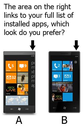
Ever since Long Zheng pointed out an alternate start screen for Windows Phone 7 I've been convinced that the older layout was the better layout. The blank area in the current start screen (example B) is referred to as the 'gutter' - but it seems to be inconsistent with the use of cutoff text in the rest of the experience. I want to see what other folks think, so click the image below and weigh in via a twitter poll on the subject:

Comments

Neither. An option to have

Neither. An option to have applications or hubs on the right "gutter" would be best.

Comment viewing options

Select your preferred way to display the comments and click "Save settings" to activate your changes.

Post new comment

The content of this field is kept private and will not be shown publicly.
  • Web page addresses and e-mail addresses turn into links automatically.
  • Allowed HTML tags: <a> <em> <strong> <cite> <code> <ul> <ol> <li> <dl> <dt> <dd>
  • Lines and paragraphs break automatically.

More information about formatting options

CAPTCHA
This is to prevent spam bots from flooding out my comments, sorry for the inconvenience.