1
2
3
4
5
6

A Decent WPF StatusBar Example


A simple, but hopefully decent, StatusBar example in WPF/XAML

Searching for information on new(er) technology can be pretty interesting. Sometimes you can find all the information you need, and other times you can't find anything. For whatever reason finding information on the StatusBar in WPF was one of those things where the articles written on the subject were slim pickings. Luckily it is really easy to reinvent the wheel in XAML if necessary once you know the basics.

It is pretty easy to create a StatusBar, it's just as you might imagine it would be in XAML:

<StatusBar> <TextBlock>Field 1</TextBlock> <Separator/> <TextBlock>Field 2</TextBlock> </StatusBar>

The problem is that typically you need something a little more advanced in your StatusBar. You'll probably want regions which can expand/contract, a tooltip to read the truncated text, some columns which are fixed width, and you probably don't want your items to go off the edge of the screen if the window is too small or the text too large either. Keep in mind that the StatusBar container behaves like a DockPanel when your trying to make use of it.

Attached is a XAML file of the StatusBar example shown above. The basic premise is that the StatusBar contains a Grid which defines the areas on the StatusBar, and some of the fields are allowed to be as large as they need while others will be truncated if they are too long to fit.

You can make any TextBlock show the Ellipses(...) by using the TextTrimming and TextWrapping properties, or in a Style definition like this:

<Style TargetType="TextBlock" x:Key="StatusBarTextBlock"> <Setter Property="TextWrapping" Value="NoWrap" /> <Setter Property="TextTrimming" Value="CharacterEllipsis" /> </Style>

.. just keep in mind that a TextBlock inside a StackPanel, or some other container allowed to grow horizontally indefinitely, will never show the ellipses because it will never actually be forcefully constrained - even if it is cut off and the full text isn't visible.

We also want to add the drag handle in the lower right corner of the Window, which can be done with the ResizeMode Window property like so:

<Window
  xmlns="http://schemas.microsoft.com/winfx/2006/xaml/presentation"
  xmlns:x="http://schemas.microsoft.com/winfx/2006/xaml"
  ResizeMode="CanResizeWithGrip">

Be sure to check out the XAML file attached and provide any suggestions you might have, or ask any questions, etc. Hopefully the keywords in this post will be good enough to help someone else down the line when trying to create a decent WPF StatusBar.

WPF Resource Monitor XAML Mockup

Every once in a while I'll get an idea for something I wish I had time to create. Today I did some searches for a resource monitor for my home server. I didn't want anything fancy, just something which showed resource usage at a glance and looks good. I didn't find much. It seems most performance monitors are commercial packages aside from Perfmon which ships with Windows.

CodingTags: 

A Sneak Peak of My Memory Game Project

Simple UI Example Numero Uno

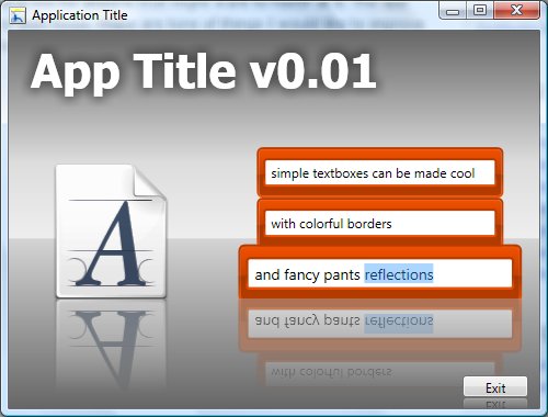
A few weeks ago I mocked up a UI and tried to create it. I got it pretty far but put it aside after one night and thought I had lost my work. Tonight I found it and was pretty surprised to see how much I already wanted to refactor after just a couple of weeks of continued reading.

I am publishing the UI as a click-once app so it can be run online, and I am posting the source too for anyone that might want to hax0r at it. The app shows off a simple reflection as well as a series of custom textboxes which grow when they gain focus. There are tons of things I would like to improve in this UI mockup, but I would rather get it posted now and move on to something more challenging.

Click the screenshot below to play with the app online

Update: Source code now attached.

Recreating Simple Windows Forms in WPF and XAML (Part 4)

Last time we covered breaking our theming out into an external file, and how to style all instances of a given UI element. We left off needing to know the details of how to style more complicated items like buttons and their mouse-over and mouse-down appearances - that is what we will cover in this final part of the series.

The biggest thing we need to keep in mind with items like buttons or comboboxes is that their appearance can drastically differ based on a computer's operating system. You can get a feel of this by changing the Foreground of a button in Vista and seeing how when a button has focus its fill actually pulsates from the normal appearance to the mouseover appearance and back - this animation is unique to Vista and not seen in XP.

(click 'read more' for the rest of the article..)

Recreating Simple Windows Forms in WPF and XAML (Part 3)

Last time we covered how to break out colors from our XAML dialog into separate color definitions in the Page.Resources section of our XAML. After doing this the next question is something like "how do I break out the color, font size, font face, etc. from each of my textbox definitions", and "how can I break these styling definitions out to a separate file" - those are what we will cover in this part of the series.

After breaking out my colors last time my footer definition ended up something like this:

    <!-- bottom panel (ok & cancel buttons) -->
    <StackPanel DockPanel.Dock="Bottom" Orientation="Horizontal" 
            FlowDirection="RightToLeft" Height="32" 
            Background="{StaticResource footerFillBrush}">
      <Button Width="72" TabIndex="45" Margin="2,2,2,2">Cancel</Button>      
      <Button Width="72" TabIndex="40" Margin="2,2,2,2">OK</Button>      
    </StackPanel>

It's cool that my background color isn't hard-coded now, but all the other styling elements are still hard-coded - that is where Style definitions come in. Style definitions basically allow you to define all the properties that should be set on an element in one spot. You can then assign the Style you created to a textbox, or a label, or any other UI element you might want to style. You give the Style a Key name just like you would a color definition and then tell the UI element to make use of that Style (there is another way to use styles across all items of a given type instead of specifying which one to use for every UI element - we will cover that towards the end of this article).

(click 'read more' to read the full article..)

Recreating Simple Windows Forms in WPF and XAML (Part 2)

One of the more obvious issues with the initial post of the dialog XAML code last night was all the hardcoded colors, so this post will be a quick example of how to use defined colors and gradients instead so that when you want to change the colors you don't have to go looking through all the XAML to find where the colors are to modify.

Here is a snippet of the original XAML, specifically the blue gradient header across the top of the dialog and the white text on it:

    <!-- Top Panel (icon, description, help, etc.) -->
    <StackPanel Orientation="Horizontal" Width="500" DockPanel.Dock="Top">
      <StackPanel.Background>
        <LinearGradientBrush StartPoint="0,0" EndPoint="0,1">
          <GradientStop Color="Navy" Offset="0" />
          <GradientStop Color="MidnightBlue" Offset="1" />
        </LinearGradientBrush>    
      </StackPanel.Background> 
      ..
      <TextBlock Width="358" VerticalAlignment="Stretch" Padding="4,4,4,0" 
                 TextWrapping="Wrap" Foreground="White">
      ..
    </StackPanel>

 
The easiest thing to do right off the bat is to just take the LinearGradientBrush definition and move it up to a Resources section you create for the Page (or Window, etc.) - since we are working with a Page we will create a Page.Resources section right under the main Page definition:

  <Page.Resources>
    ..
    <!-- header panel styles -->
    <LinearGradientBrush x:Key="headerPanelFillBrush" StartPoint="0,0" EndPoint="0,1">
      <GradientStop Color="Navy" Offset="0" />
      <GradientStop Color="MidnightBlue" Offset="1" />
    </LinearGradientBrush>
    <SolidColorBrush x:Key="headerTextColor" Color="White" />
    ..
  </Page.Resources>

 
There are two brushes defined in that snippet - the 'headerPanelFillBrush' which is the blue gradient fill in the header, and the 'headerTextColor' which is the white color used for the text - these brushes will be referenced by the value we set for their 'x:Key' tag.

(click 'read more' to read the full article..)

Recreating Simple Windows Forms in WPF and XAML (Part 1)


So after two or three weeks of playing around with WPF/XAML I figured the best place to go next was to try and do some dialogs like I might do today in Windows Forms. I wrote these by hand using the Kaxaml tool mentioned on the recent Scott Hanselman podcast, and if you have that installed you should be able to make use of the .xaml files attached to this post pretty easily.

Keep in mind that this XAML is by hand (with Kaxaml's intellisense), not created via Blend or VS2008, and the XAML is probably atrocious to XAML experts - that's sort of the point. I'll be referring back to this project as I improve it - this post is just the initial post.

A simple dialog

(click 'read more' to read the full article..)

The WPF Journey - Beginning Baby Steps

About a year and a half ago I picked up a copy of Windows Presentation Foundation Unleashed based on a suggestion from a Microsoft rep at a mini code camp they held for businesses in my business sector. I enjoyed the WPF/Silverlight discussion they had, especially since it gave me a chance to ask some questions on the subject, but aside from buying the book I made little actual effort in trying to learn WPF since then.

CodingTags: